

Cup O' Joe
An interactive kiosk that enhances coffee ordering experiences for new and existing consumers. Designed for UCSD Design Lab.
My Role
My Contribution
UI/UX Designer
User Research
Persona
Storyboard
Kiosk Design
Wireframes
Prototypes
Usability Testing
Tools Used
Team
Duration
Figma
Adobe Creative Suite
Google Suite
4 UI/UX Designers
8 weeks
Challenge
For many individuals, coffee has become a necessity, a staple in their day-to-day lives. Subsequently, the ordering process is an essential experience that customers have to deal with every time they go to their favorite coffee shop.
Their experience could be affected by variables such as a language barrier (complex coffee jargon), or the lack of order-takers and baristas to complete their drinks quickly. Thus, our kiosk was designed to create a new ordering system that allows customers to order quickly and with ease.
Goal
Design a self-ordering kiosk that
-
Reduces wait time in line.
-
Reduces ordering time.
-
Increases customer retention.
-
Attracts new consumers.
Outcome
We surveyed 40 UCSD students, 38 out of 40 endorsed the UI and the kiosk prototype and said they will order from our kiosk if they see one at the coffee shop.
Design Process
Iteration
User Research
User interview
Online research
Analyze
Ideate
Implement
Persona
5 Whys
Storyboard
Rapid prototype
Wireframe
Digital prototype
Kiosk prototype
Evaluate
Usability test
Uncover problems
Discover user behaviors
Iteration
USER RESEARCH
User Interview
As part of our research to help better understand the problems that users face within coffee shops, we conducted semi-structured interviews with 4 potential stakeholders.
1.
Understand users' motives of going for a coffee shop.
2.
Understand user preference.
Grab and go?
Stay for a while?
3.
Understand the pos/neg coffee ordering process users had experienced.
4.
Gain insights from users' experience with interactive kiosks.
Online Research
Use of self-ordering kiosk drives revenue
Recent study on McDonald’s kiosks found that customers actually bought more items when using the kiosks since it enabled users to dwell on the menu longer.
Users endorse drink customization
When using the self-ordering kiosk, customers are more readily utilizing the customization options available in items.
“Language barrier” between coffee shops and novice consumers
Many coffee shop menus consist of dozens of options with names written in coffee shop colloquialisms. Customers may be overwhelmed by the number and meaning of the customization options available to them. As a result, customers may settle on the most basic or popular drink despite it not being their best option.
ANALYZE
Persona
Based on our user interview and online research, we generated the persona and gathered the key findings of user needs.


User insights
1.
Customers need intuitive and quick ordering with easy customization.
2.
Customers want to order at their own pace and leisure.
3.
Customers want to be more confident in their buying process and decisions.
OPPORTUNITY
How might we better serve both novice and regular coffee shop customers to make coffee ordering more efficient and approachable?
IDEATE
Solution
Our proposed solution became two-fold; a POP interactive kiosk with digital screen and coffee dispenser, and an app that provides the customers an alternative check-out experience.
1.
Enhance and expedite the ordering process by remembering user's preferences and allow users to access their frequent orders for faster checkout.
2.
Enable drink customization and ingredient visualization.
3.
Design a built-in drink dispenser for monthly drink special try out.
4.
Design a reward point system.
CUSTOMIZATION
Enable drink customization and ingredient visualization
Users can customize their drinks based on size, temperature, type of milk, flavor, and number of the espresso shot, which is helpful for customers when they need to order multiple drinks with customization. Hence, novice coffee consumers could visualize how the ingredients differ from various types of coffee.


PURCHASE HISTORY
Expedite checkout and optimize user experience
Customers can access their order history to expedite their checkout experience. They no longer need to repeatedly navigate the screens to find or customize their drinks to checkout.


MONTHLY SAMPLES
Attract new consumers by free seasonal drink try-out
By trying out free samples, users are more confident in purchasing full-size beverages. This eliminates customer purchase hesitation and removes their uncertainty about the taste of new beverages. It also helps coffee shops differentiate themselves from competitors and attracts new customers by offering unique products.
REWARD SYSTEM
Sign up for loyalty program to earn rewards
Users can sign up or log in to their loyalty program to discover new deals and earn points for every purchase. This helps to drive revenue, retain existing customers as well as attract new customers.


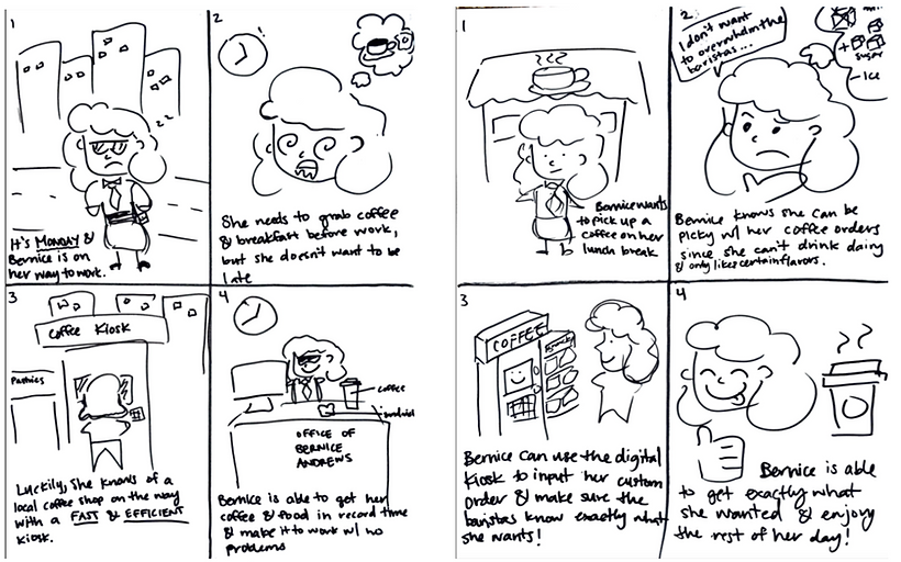
Storyboard
IMPLEMENT
Rapid Prototype
1. Splash screen

2. Menu screen

4. Menu screen (updated cart)
5. Review cart screen


3. Drink customization screen

Kiosk Sketches
Initial Sketches

Refined Sketches

Kiosk Prototype
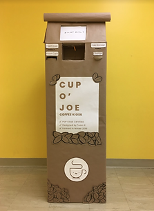
A front view of the Cup O’ Joe Kiosk, made to resemble a bag of coffee beans with a label on the front.

A view of the front and side of the kiosk, including decorative coffee bean details on the sides.

The top of the kiosk contains the major functionality of the kiosk, including the digital screen, payments methods, and receipt/change distribution. In the center, customers can try a sample of the featured drink (this area lights up when the user selects the option on the screen).

The bottom of the kiosk contains decorative elements of the kiosk, including a label and coffee bean motifs. It also contains the kiosk logo.
The design of our kiosk was based after the form of a ground coffee bag, with the ordering screen located on the top with the sample dispenser directly below it, flanked by the payment options our kiosk accepts.
The coffee kiosk has been designed to allow for intuitive and quick ordering with fun graphics and easy customization. The design of the kiosk is useful for both experienced and inexperienced coffee drinkers as it allows both types of users to order at their own pace and leisure, bridging the gap in knowledge and experience. Additionally, our kiosk has the added functionality of providing small samples for users, in order to better inform their buying process and decisions.
Style Guide


Moodboard

Our moodboard was inspired by warm-colored tones and coffee shop settings. We wanted our designs to be simple but also playful.
EVALUATE
Usability Testing
Goals
The primary aim of this usability testing endeavor is to elevate task completion rates, lower error rates, and reduce task completion times. Additionally, we seek to gather actionable feedback from users to drive iterative improvements in the product's design and functionality.
User Tasks
1. Try a sample of the drink of the month.
2. Locate and identify the ingredients for London Fog.
3. Order a latte with the following criteria: medium, ice, oat milk, hazelnut flavor, with1 extra shot of espresso.
4. Count your drink toward your reward points.
5. Checkout using debit card payment method.
Areas of Improvement
-
We refined the flow of reward system to be more intuitive to users.
-
We clarified customization option "espresso shot" to "extra shot."
-
We increased color contrast.
-
We ideated a feature for faster checkout by adding login/sign up function in the splash screen that allows users to access their purchase history and pay.
User Feedback
-
Users value reward systems at coffee shops, which encourage loyalty to particular shops.
-
The ordering system is extremely helpful if they need to customize multiple drinks.
-
38 out of 40 users said they will use the coffee kiosk to order if they see one in the coffee shop.
Iteration

-
Enhanced color contrast entirely to improve readability.
-
Added sign-up for users to add their phone numbers.
-
Decreased the padding of buttons to have a better visual appeal.

-
Changed "COLD" to "ICED" to follow the convention.
-
Changed "Espresso Shots" to "Extra Shots" to avoid confusion.

-
Separate rewards and payment to avoid confusion.
-
Change the background image to match the brand logo.
Final Thoughts & Takeaways
Digital Screens:
1. set the price of different drink sizes. Since our user-tasks only required the users to order a medium size latte, we didn’t realize that we did not specify the price for different sizes.
2. implement on the scrolling bar and the search bar.
Kiosk:
1. add a pin-pad under the “card insert” slot, so that the users can be more securely entering their debit card pin numbers.
2. include the use of additional lights to signal users where to insert their physical payment method, corresponding to the one they chose on the kiosk screen.
3. work on additional improvements on our sampling dispenser and quality of life. Add sanitation wipes and trash cans located inside or beside the kiosk for users to dispose of sample coffee cup.
Avoid Potential Pitfall:
Since we only focus on college campus setting, the demographic of customers are limited to college students. We had once reframed the problem to how to make the coffee ordering and waiting experience more enjoyable in contrast to how to make it more expedited. However, we have done interview sessions with students, and most of them could only get their coffee or snack during class break for about 5 to 10 minutes. More than half of the interviewees prefer grab and go rather than staying. If I have more time, I wish to conduct user research and usability testing on coffee consumers with different demographics to further improve and iterate the prototype.